
Simple icons consistently outperform complex ones in App Store testing. Users decide in milliseconds—a clear icon communicates faster. A productivity app saw 35% more downloads after switching from complex dashboard to single checkmark. Strong typography can increase downloads 25%. Less is more.
Simple App Icons That Convert: Real Results and Examples
A productivity app saw downloads jump 35% after simplifying their icon from a complex dashboard to a single checkmark. Here's what actually works in simple icon design, backed by real data.
Why Simple Icons Work Better
In App Store testing, simpler icons consistently outperform complex ones. Users make decisions in milliseconds - a clear, simple icon communicates faster and drives more clicks.
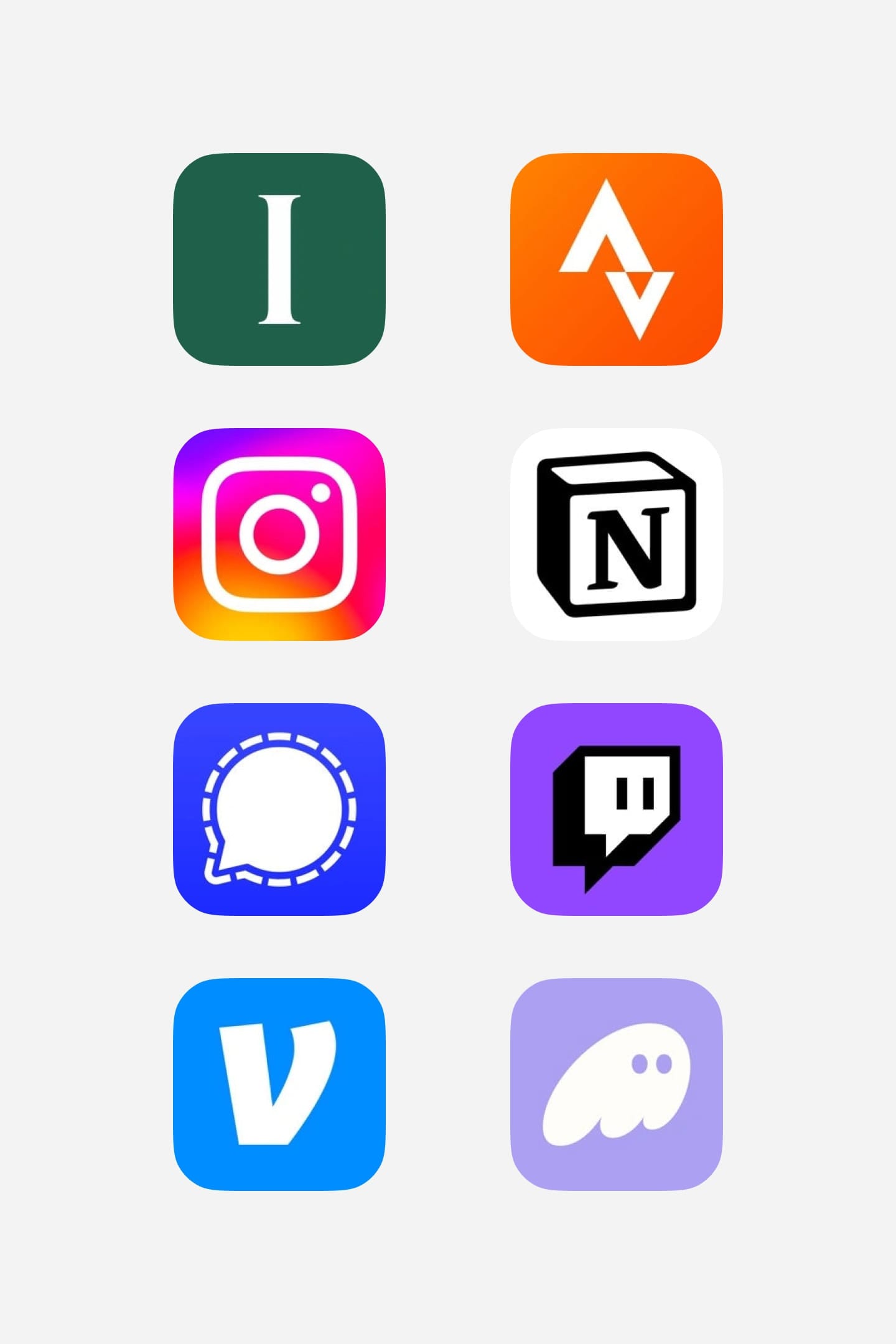
From left to right: Impress, Strava, TBH, Notion, Signal, Twitch, Venmo, Phantom.
Elements That Convert
Strong typography drives results. A finance app increased downloads 25% by using a bold single letter instead of a complex graph. Clear symbols work - a fitness app saw 20% more clicks after switching to a simple dumbbell icon.
Testing for Impact
Start with your core feature. A note-taking app tried various designs but found a simple pencil icon performed best, increasing CTR by 30%. Test different levels of simplicity - sometimes ultra-minimal isn't the answer.
Maintaining Brand Identity
Simple doesn't mean boring. That productivity app? Their checkmark became instantly recognizable, driving both downloads and brand recognition. Focus on one strong element that users will remember.
Remember: in icon design, less is often more. Test different levels of simplicity, measure results, and let data guide your decisions.