Choose flat design for modern apps needing scalability, fast loading, and clean aesthetics. Use skeuomorphism for unique, immersive experiences requiring visual richness. Flat works best for tech-savvy users and quick recognition apps like navigation. Skeuomorphism appeals to users seeking familiarity and realism.
Flat Design vs Skeuomorphism: Which Works Best for App Icons?
The debate between flat design and skeuomorphism isn't new, but I find myself revisiting it often. A few years ago, I worked on an app icon for a financial tool and faced the tough decision between these two styles. Ultimately, my choice hinged on the app's target audience and functionality. Let’s explore how to make this decision for your project.
What is Flat Design?
Flat design emphasizes minimalism. It avoids textures, gradients, and shadows, opting instead for clean lines and solid colors.
Pros:
- Easy to scale and adapt.
- Modern and sleek appearance.
- Faster to load, which can be critical for web apps.
Cons:
- May appear too generic.
- Less visually engaging for some users.
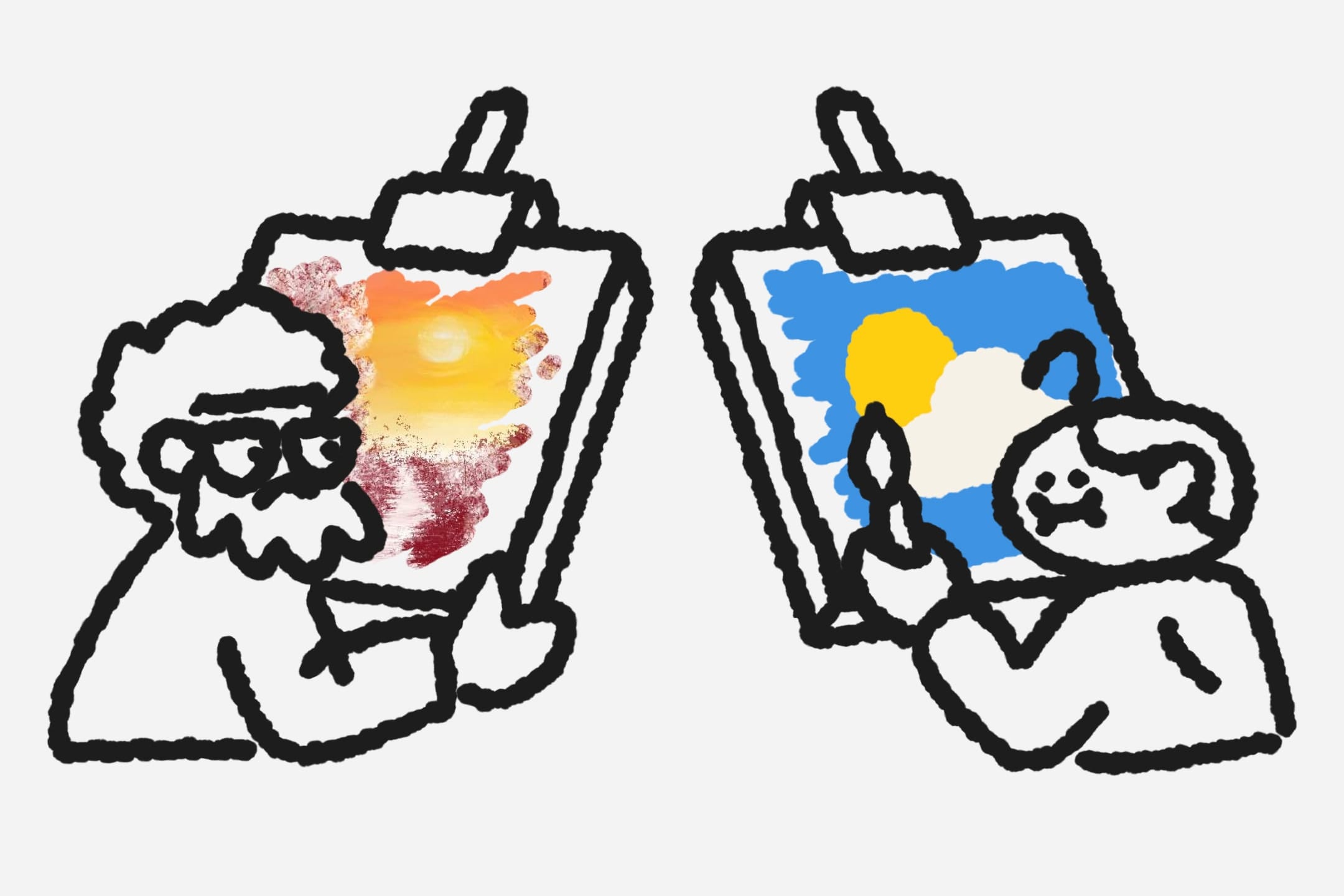
What is Skeuomorphism?
Skeuomorphism mimics real-world textures and objects, using gradients, shadows, and intricate details to create depth.
Pros:
- Visually rich and engaging.
- Appeals to users who prefer realism.
Cons:
- Can look outdated if overdone.
- Requires more design time and expertise.
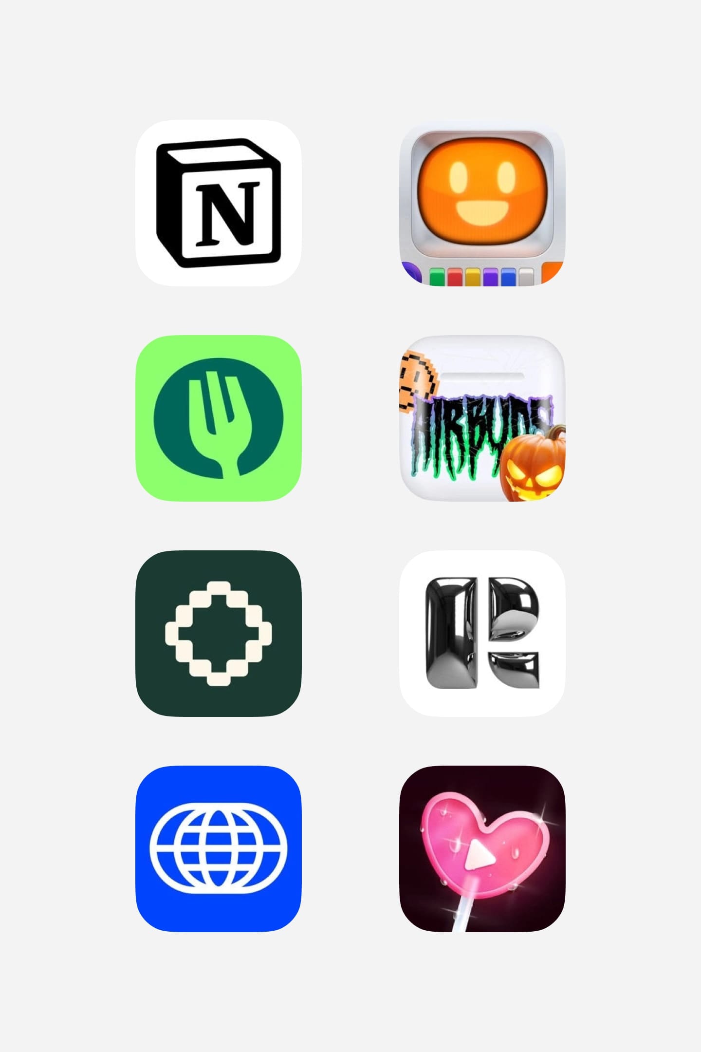 From left to right: Notion, Mist, TheFork, Airbuds, Bezel, Retro, Universe, Shorts
Key Factors to Consider
-
Audience Preferences
Flat design works well for tech-savvy users, while skeuomorphism might appeal to users looking for familiarity. -
App Functionality
Apps requiring quick recognition, like navigation tools, benefit from flat icons. Entertainment apps might thrive with skeuomorphic designs. -
Trends and Branding
Flat design aligns with current trends, but skeuomorphism can be a bold choice to differentiate your app.
My Recommendation
For most modern apps, flat design is a safe, versatile choice. However, skeuomorphism shines when you want to create a unique, immersive experience.