
Run A/B tests by measuring baseline CTR, testing one element at a time, and waiting for 1,000+ impressions per variation for statistical significance. A meditation app saw 28% CTR improvement with a simpler design. Systematic testing can increase downloads by 75%.
App Icon A/B Testing: Real Results That Increased Downloads
A few years ago, I worked with an app developer whose icon was "perfect" in their eyes. After running systematic A/B tests, we achieved a 75% increase in Click-Through Rate (CTR). Here's exactly how we did it, and how you can replicate these results.
Understanding Icon A/B Testing
Your app icon is prime real estate in the App Store. Every pixel matters when competing for attention. A/B testing removes guesswork by providing concrete data about what works.
Running Effective Tests
Start by measuring your current icon's performance through CTR, conversion rate, and impressions. Use App Store Connect or Google Play Console for accurate baseline metrics.
When testing changes, focus on one element at a time. For example, we tested adding a neon outline to a fitness app's icon, which resulted in a 12% CTR increase. This isolated approach helps identify exactly what drives improvements.
Real Test Results
A meditation app tested two variations:
- Original: Abstract blue waves
- New: Simplified white circle on blue Result: 28% CTR improvement with the simpler design
A photo editing app tested:
- Original: Camera icon
- New: Camera with rainbow accent Result: 35% higher conversion rate
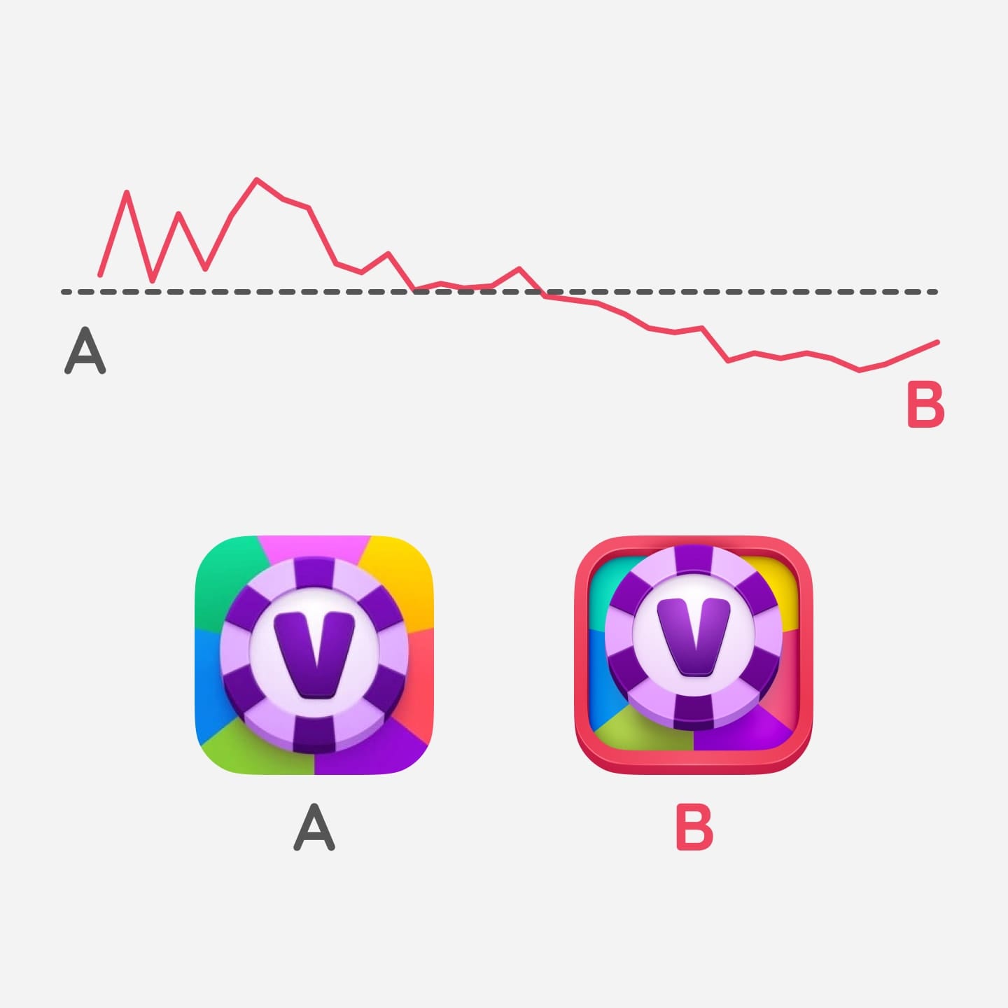
Real A/B test results from Vortex Poker, showing the B version failed the test.
Analyzing Your Results
Wait for statistical significance - typically 1,000+ impressions per variation. A gaming app we worked with saw initial promising results, but waiting for full data revealed different patterns.
Seasonal Testing Opportunities
Consider testing seasonal variations during key periods. A shopping app's holiday-themed icon drove 40% more downloads during December. Plan these tests in advance to maximize impact.
The key is persistence and systematic testing. That skeptical developer? They now run quarterly A/B tests, and their downloads have more than doubled. Start small, measure carefully, and let the data guide your decisions.